The Danish Health Authority
How to balance screen time and quality time?
The Danish Health Authority recognized that there is a need for some light-hearted guidance on how to have control over screen time within the family.
Not because the screen itself is inevitably harmful, but because it can take the time from other activities that may have an impact on children’s health and well-being. The campaign is aimed to help parents to be able to be simply more attentive to children's screen time.
We had full creative ownership of the concept and character development, design, modeling, and of course, the complete production of the animation.
13 films were created in total, in a way that they can stand alone, or they can be played one after the other.
For parents with children from 0-5 years
For parents with children from 6-15 years
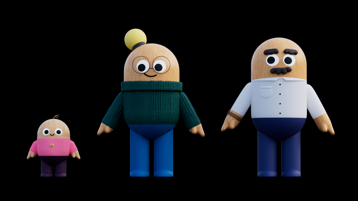
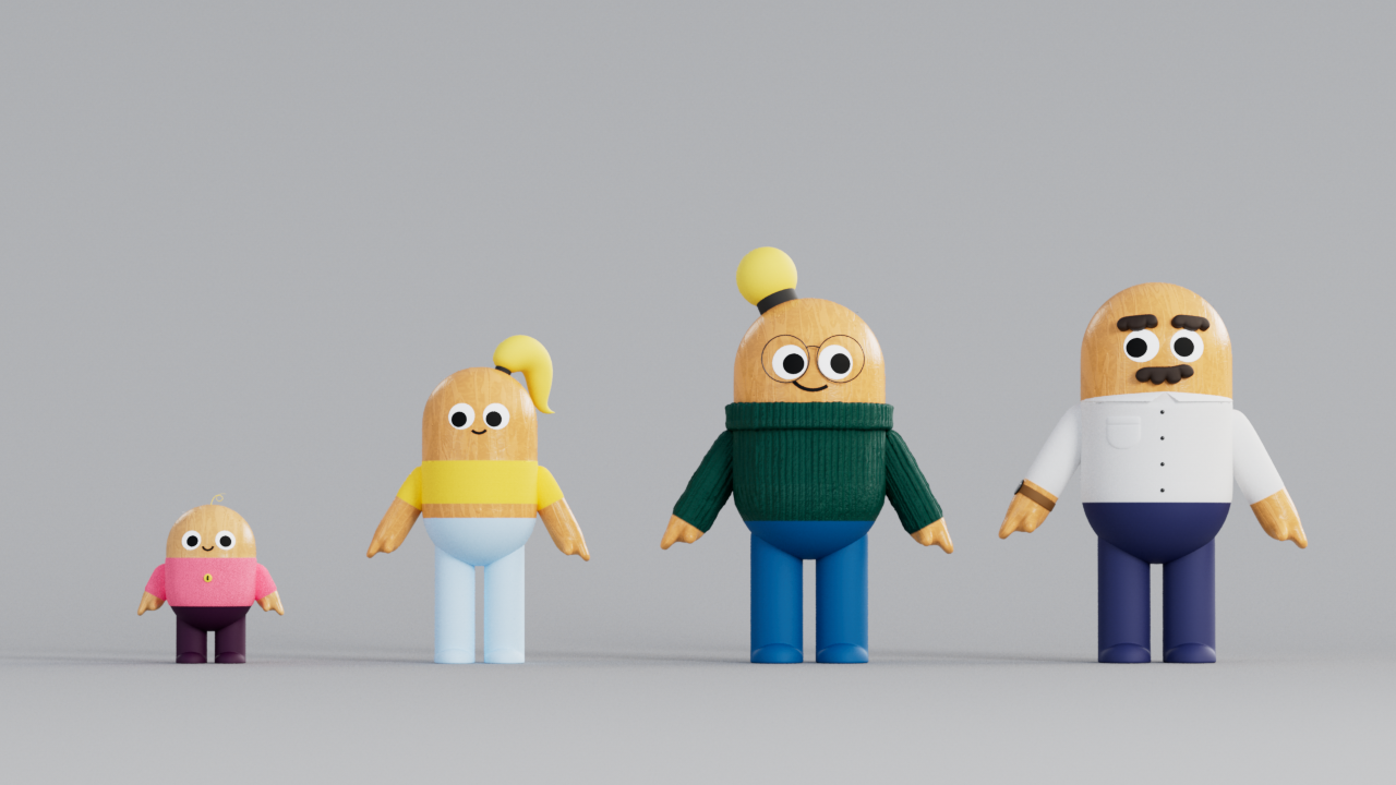
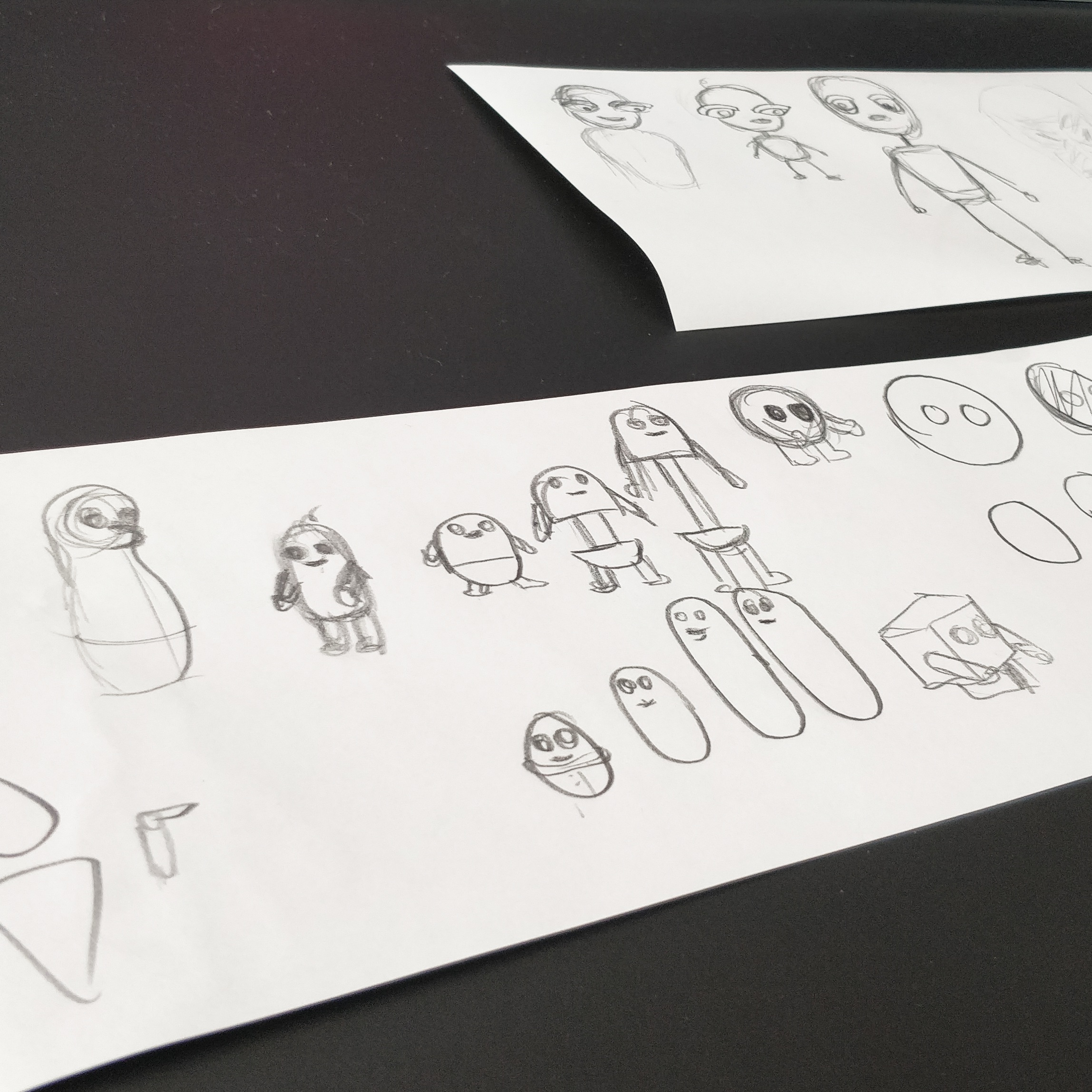
Concept & character development
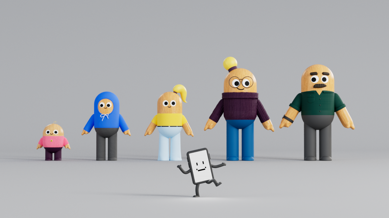
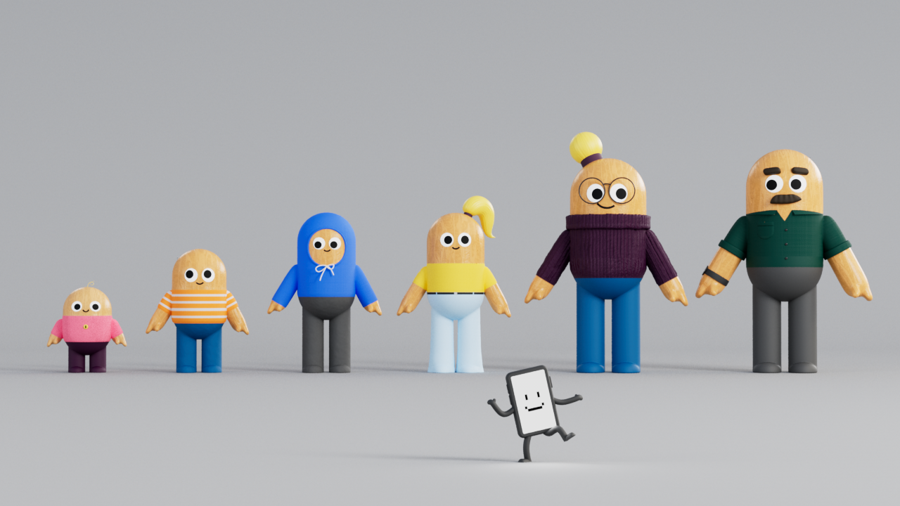
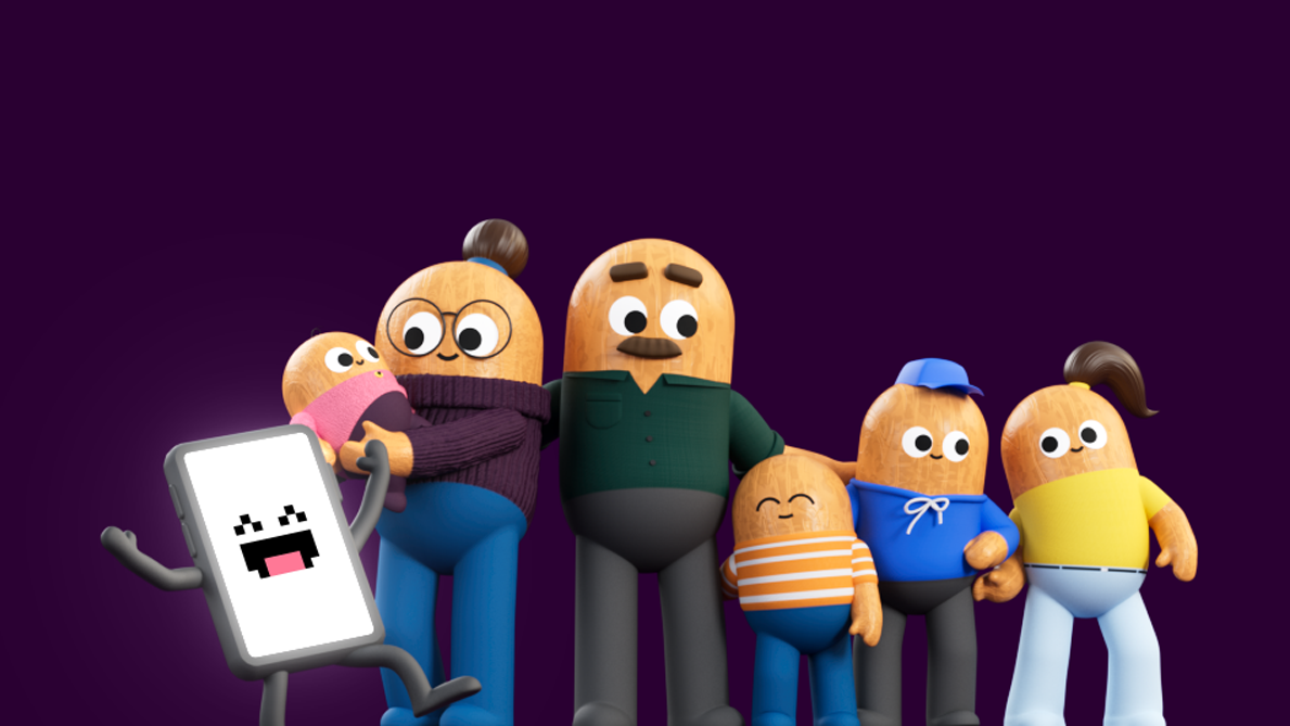
We wanted to make sure that no one feels like they are being scolded while watching the films. The tone of voice we suggested is cheerful and informative.
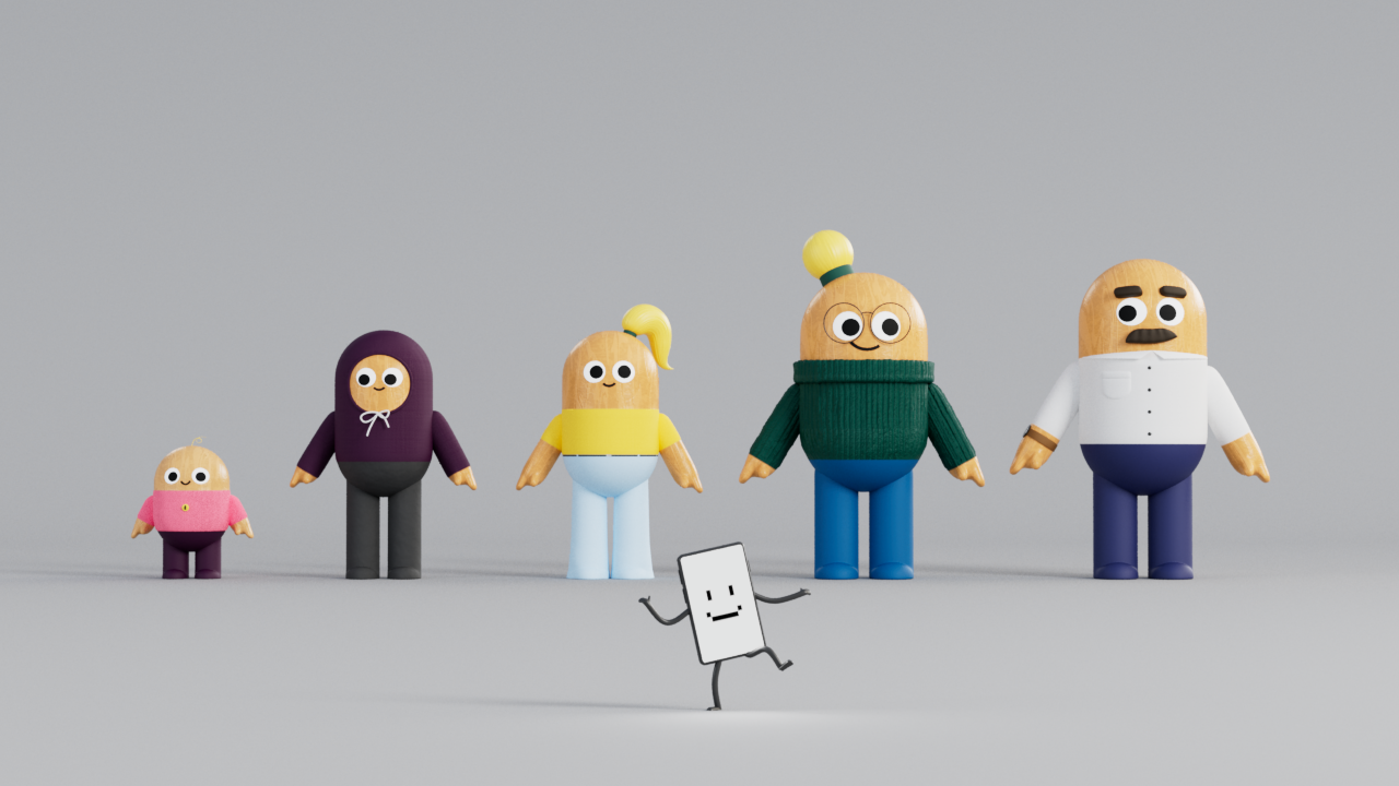
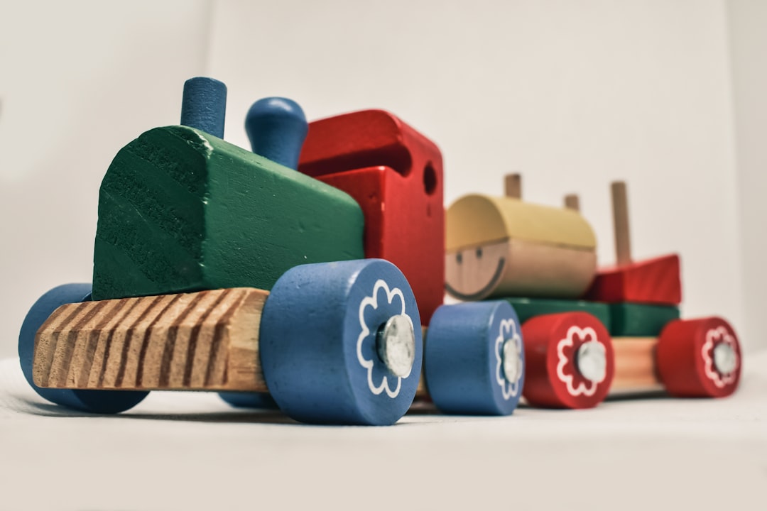
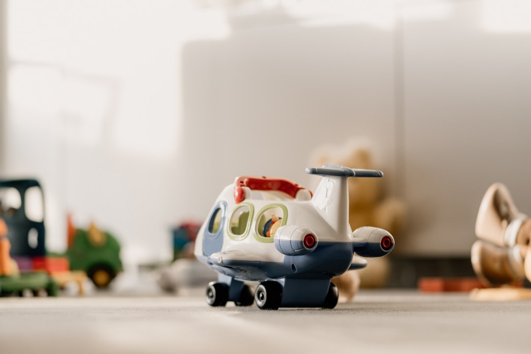
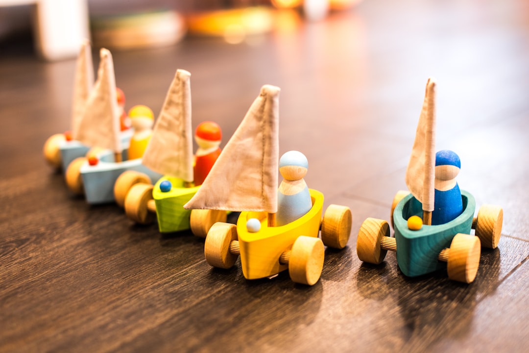
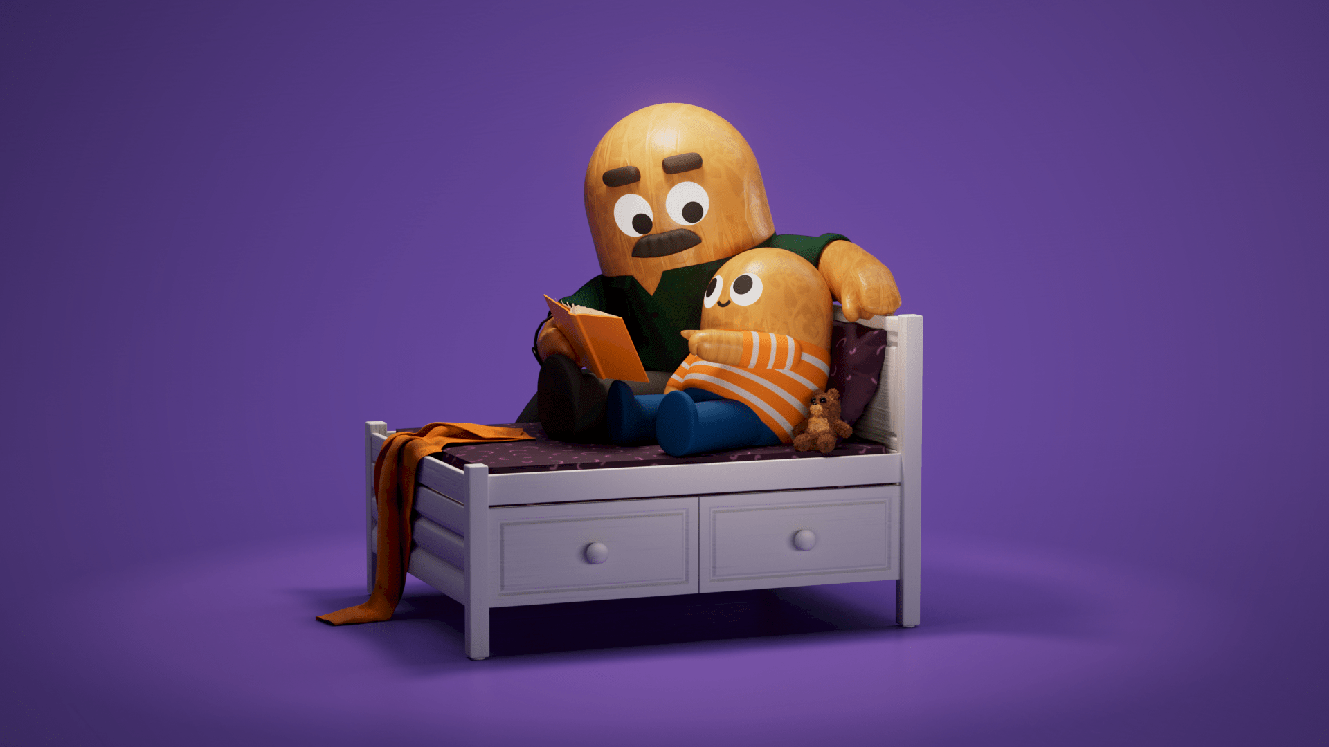
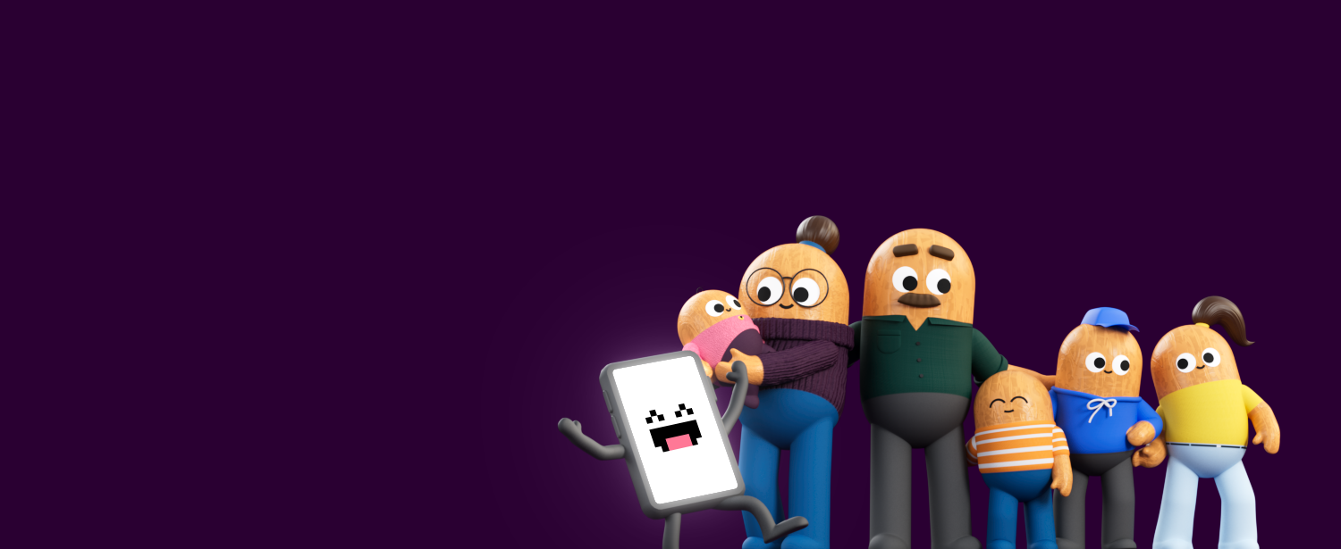
The characters having a wooden body was coming from inspiration from the physical world, from toys for children. When developing the look, we wanted to place some subtle reminders that we need to balance our digital presence and physical needs.



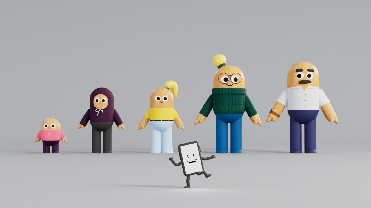
Meet the screen
The personality of this little guy was dreamt to be similar to your most extrovert friend who is also a bit silly and does not know when to stay silent.
It is obvious that screens are an unavoidable part of our daily lives. The impact can potentially affect our health and well-being, both positively and negatively, so at the end of the day this is about education on boundaries and control. This is what this character wants to annoy out of you.

Process
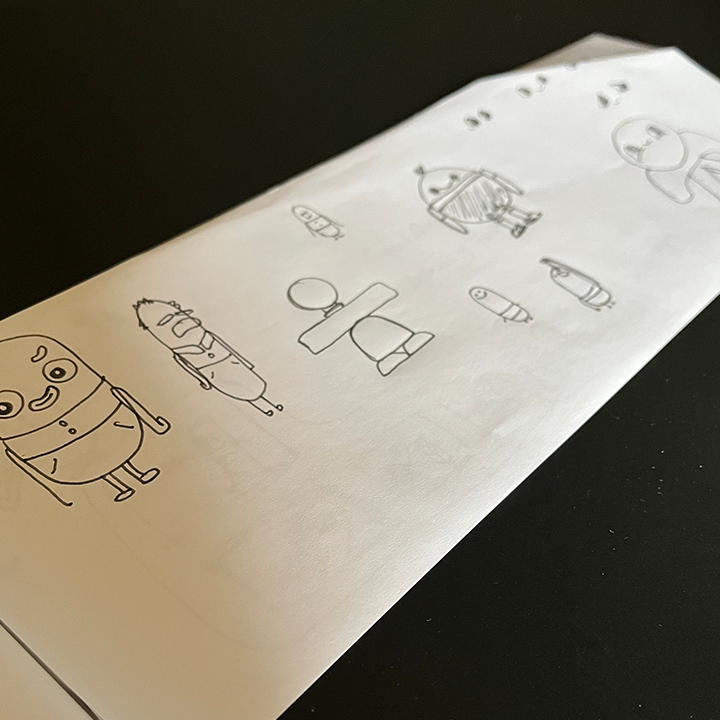
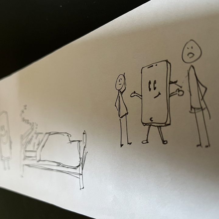
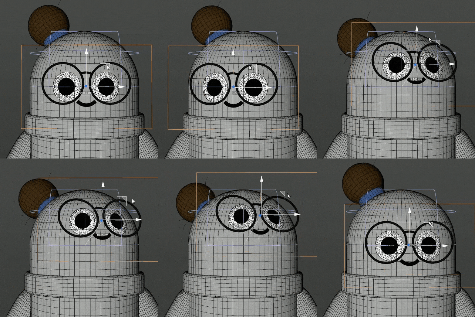
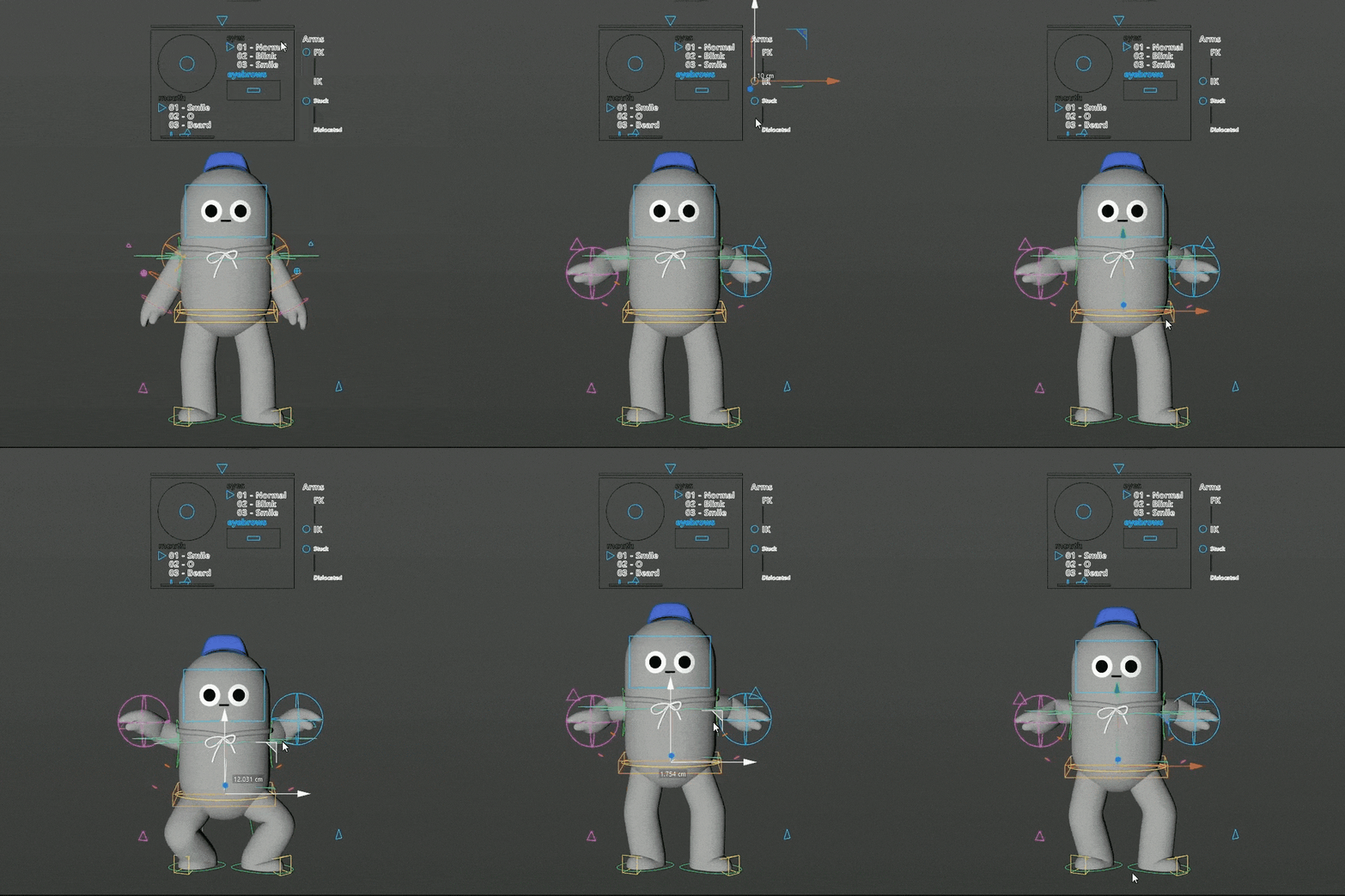
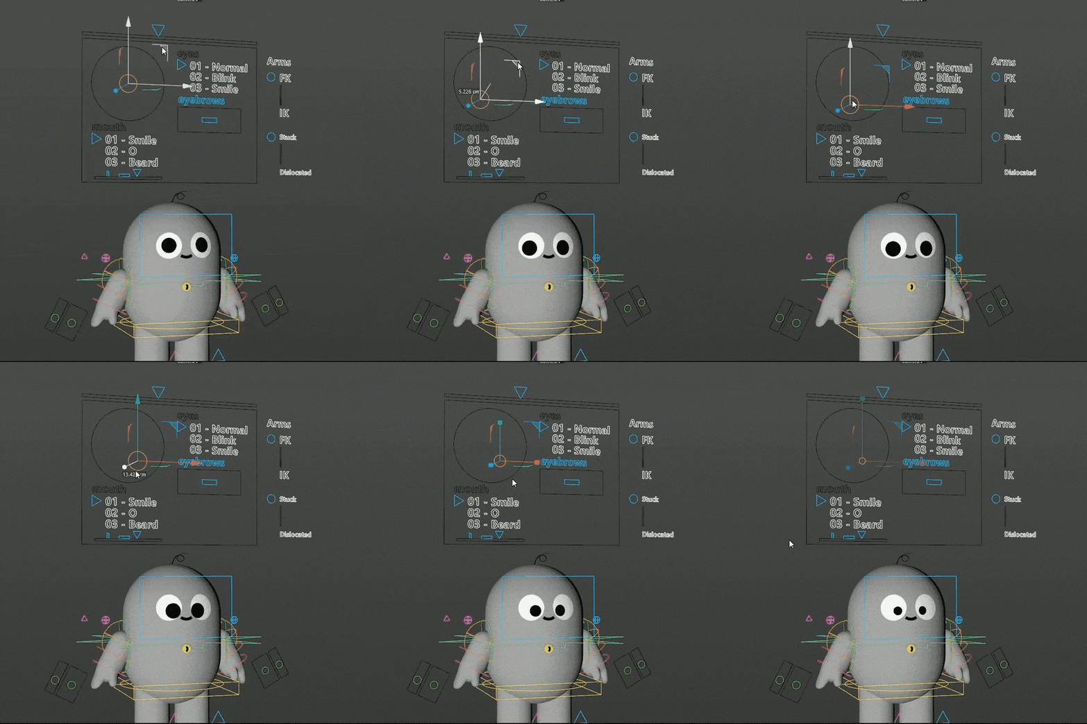
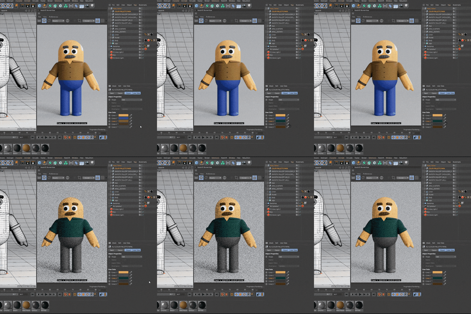
The below progress snaps show how evolving this process was. From sketches, through styleframes, til pre-visualization we travelled the sometimes sweaty journey of all animators.
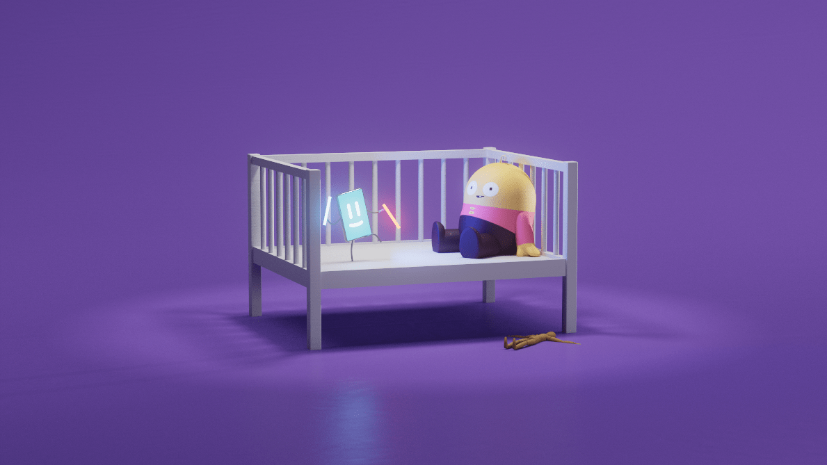
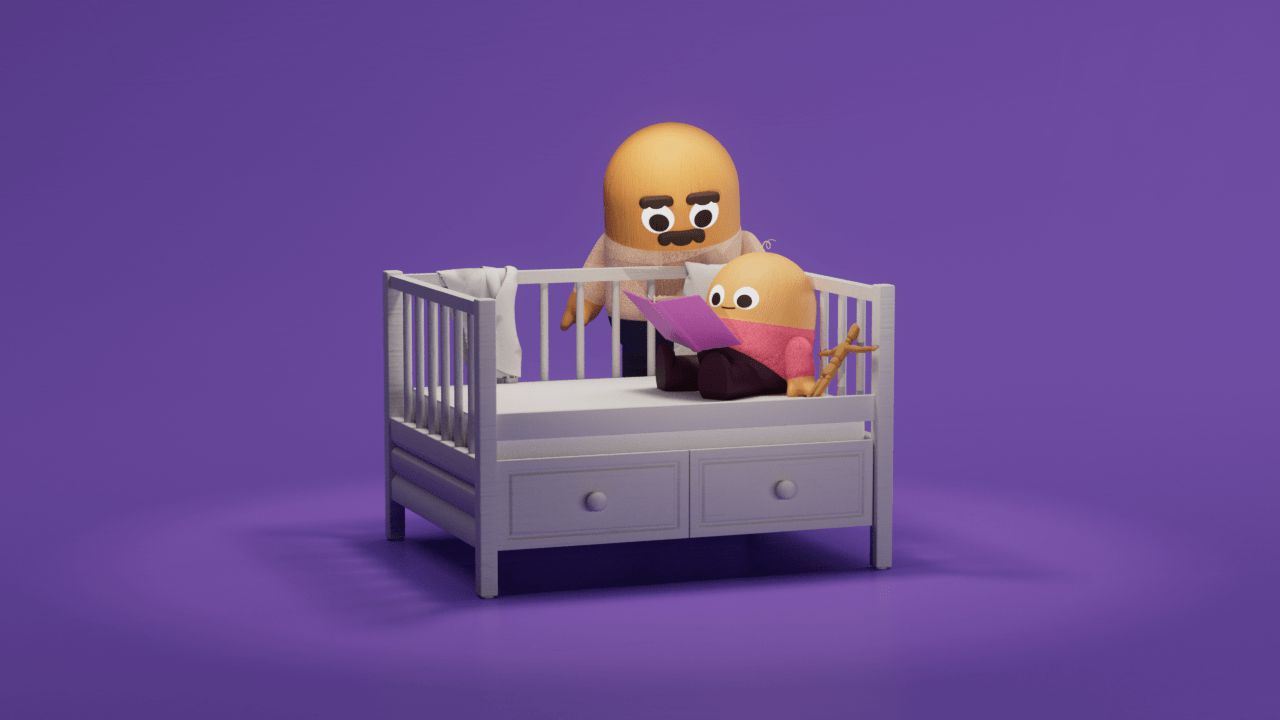
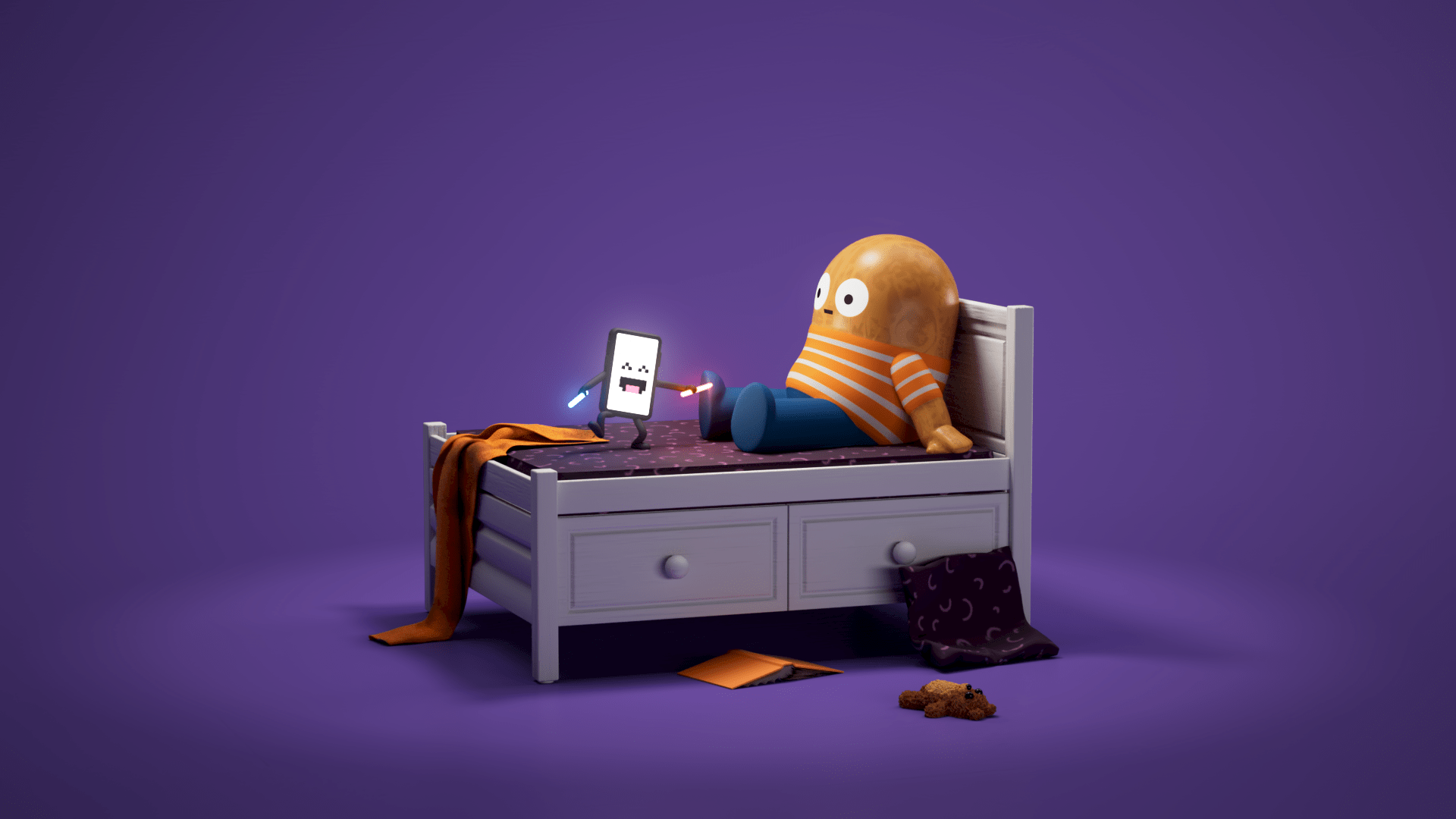
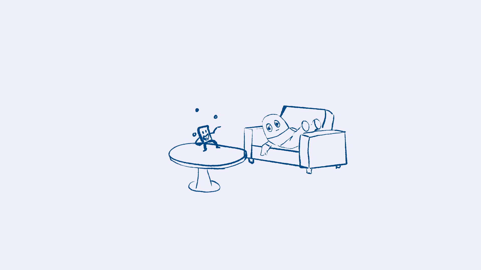
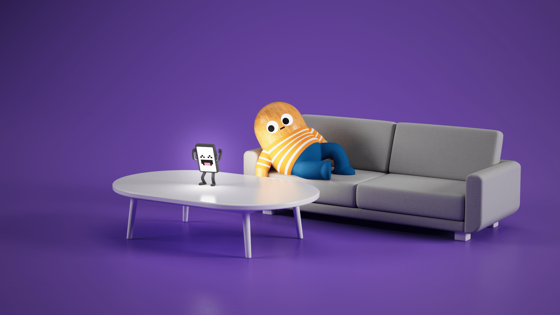
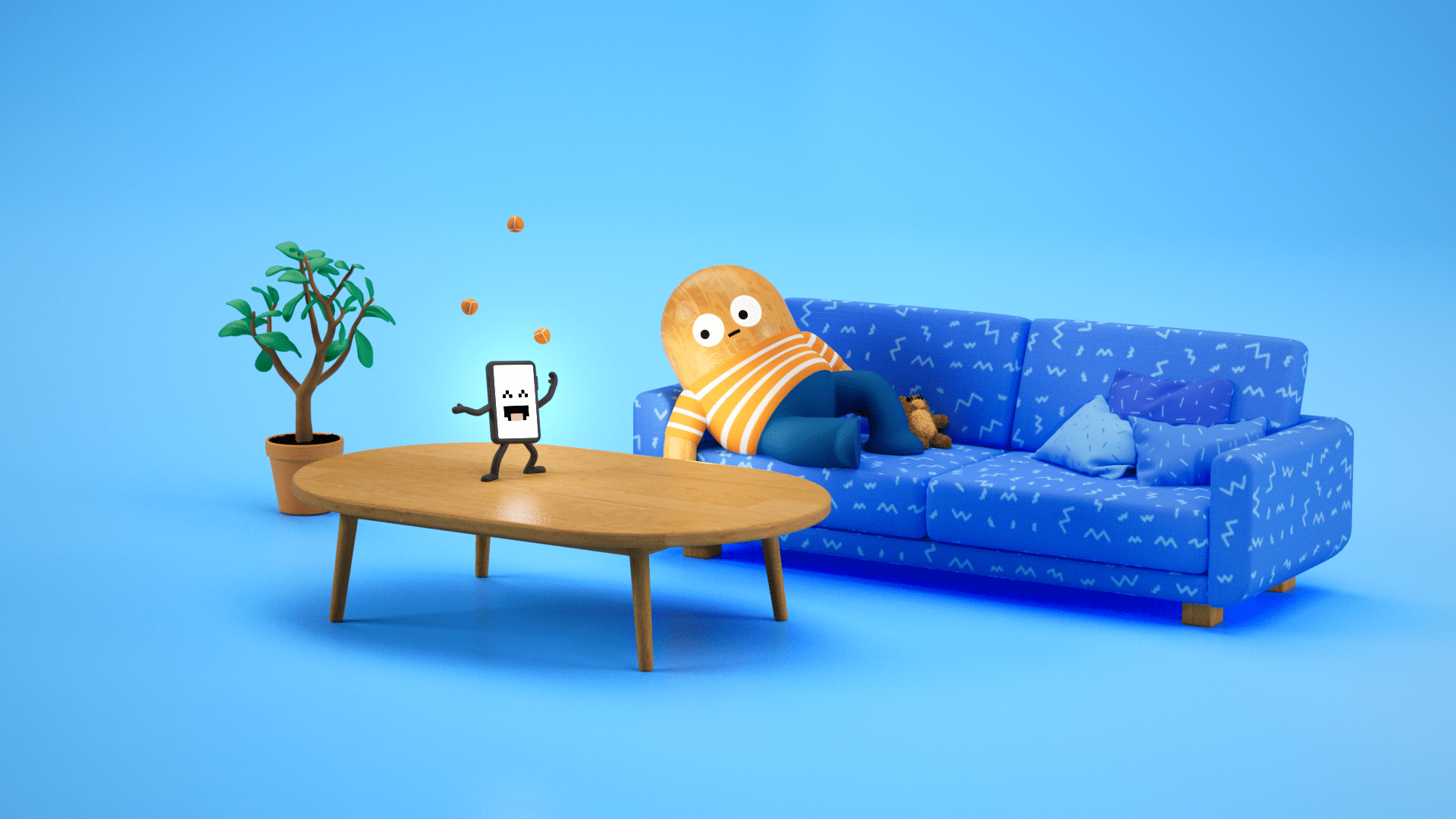
Once everyone was happy with the concept, the creative process and the steps of execution were meticulously repeated for all 13 films. Of course, we had approval rounds in between the stages.
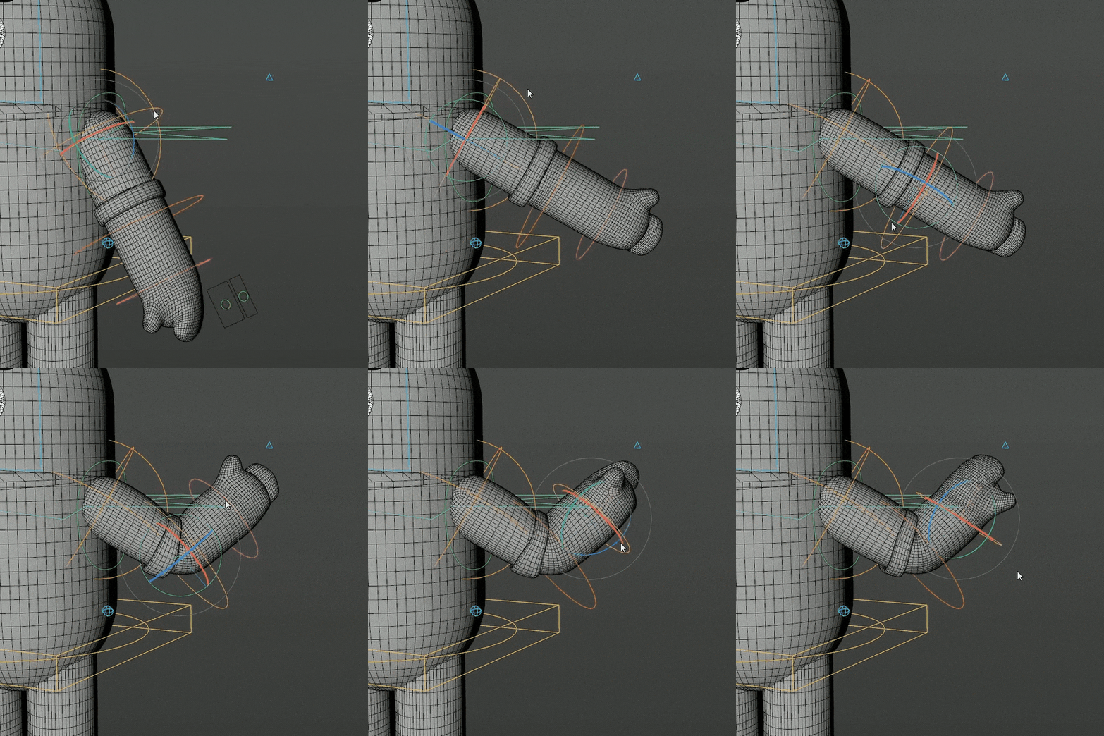
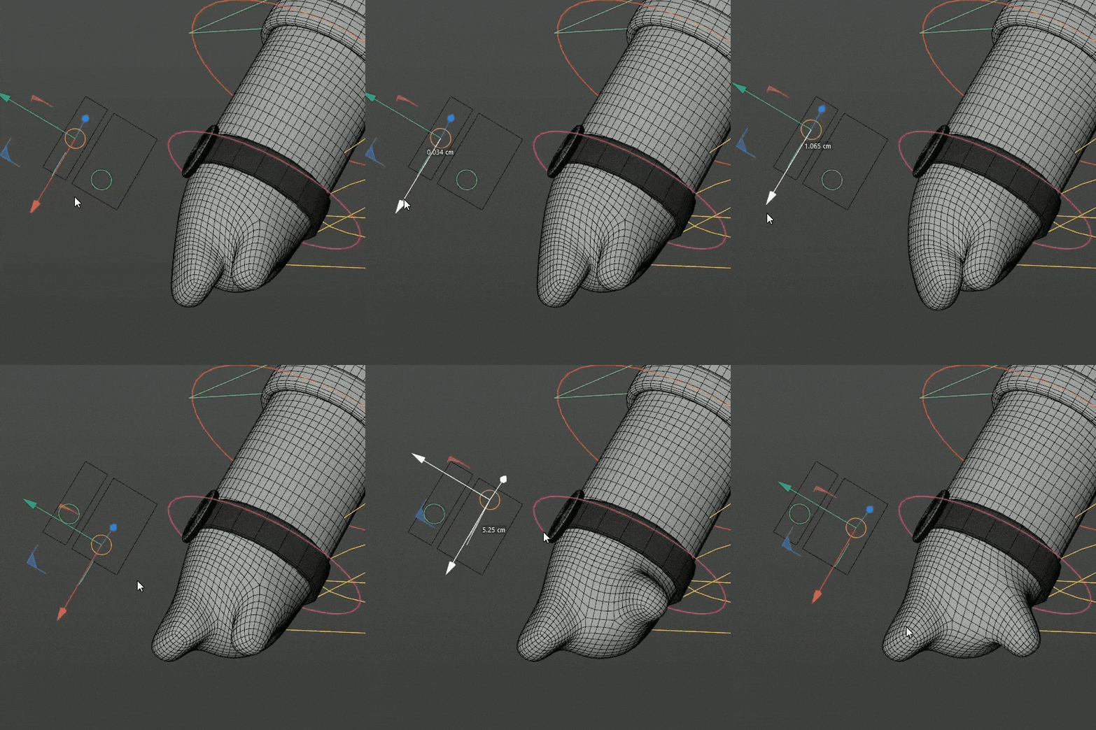
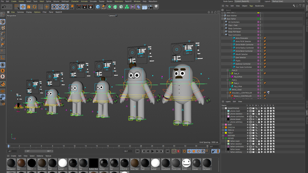
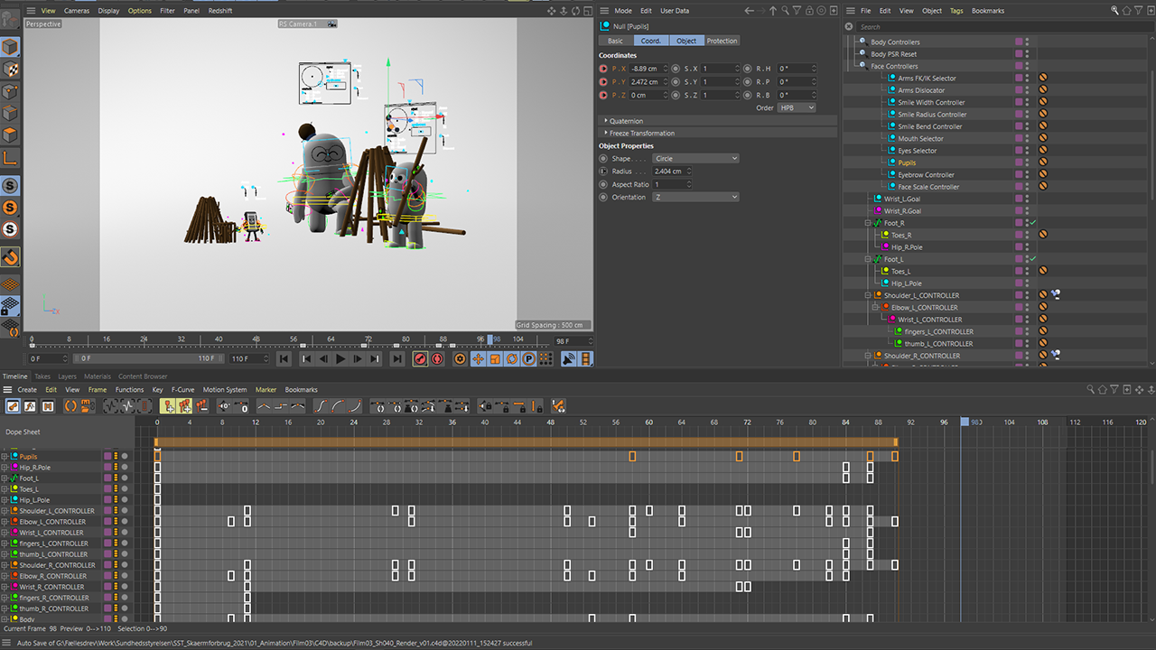
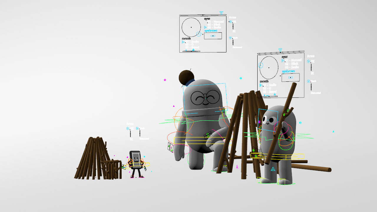
Mainly Cinema4D was used to prepare everything for animation. We kicked off with the design part with sketching ideas on paper. Then modeling, texturing and rigging came, when we drew the scene in 3D with a suggestion for props, lightning and the surfaces. The animation started with the key poses being mapped out to set the timing of the scenes and to guide the animator how to place the in-betweens.
We worked in After Effects to tweak colours and add text breakers, and finally sound effects were put in the mix too. Once we got a preview render approved for the final animation, we had a beauty render cooking overnight, and we were done.
One of the interesting parts was that the rigging needed to be made from scratch to fit the unique body type of these characters. For example when the facial expressions were created, the “face” needed to be bended over the still, wooden base, and this was something that we hadn’t done before.
Extras
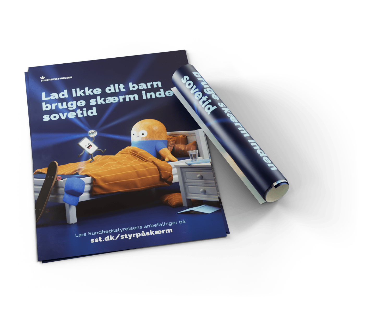
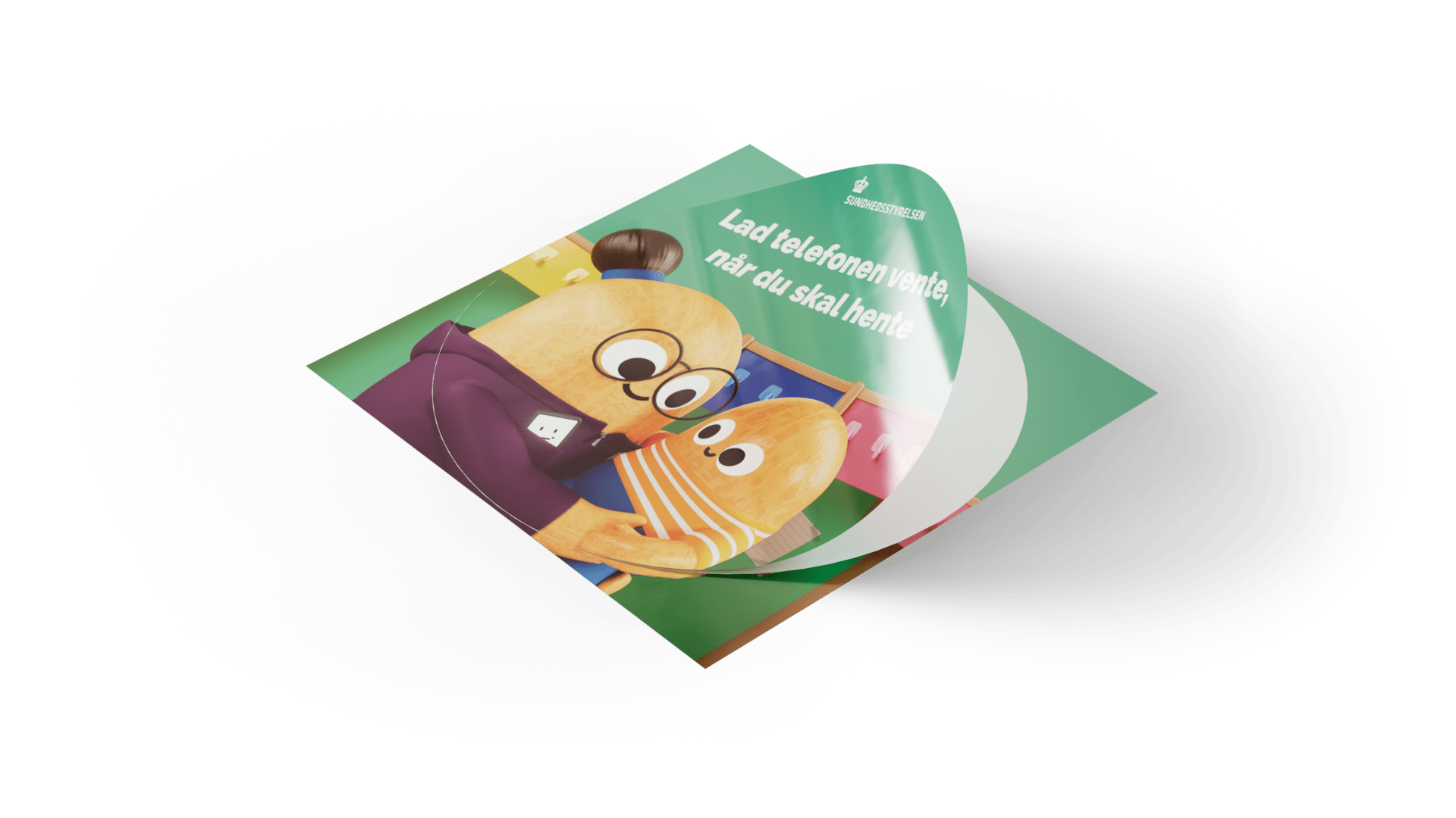
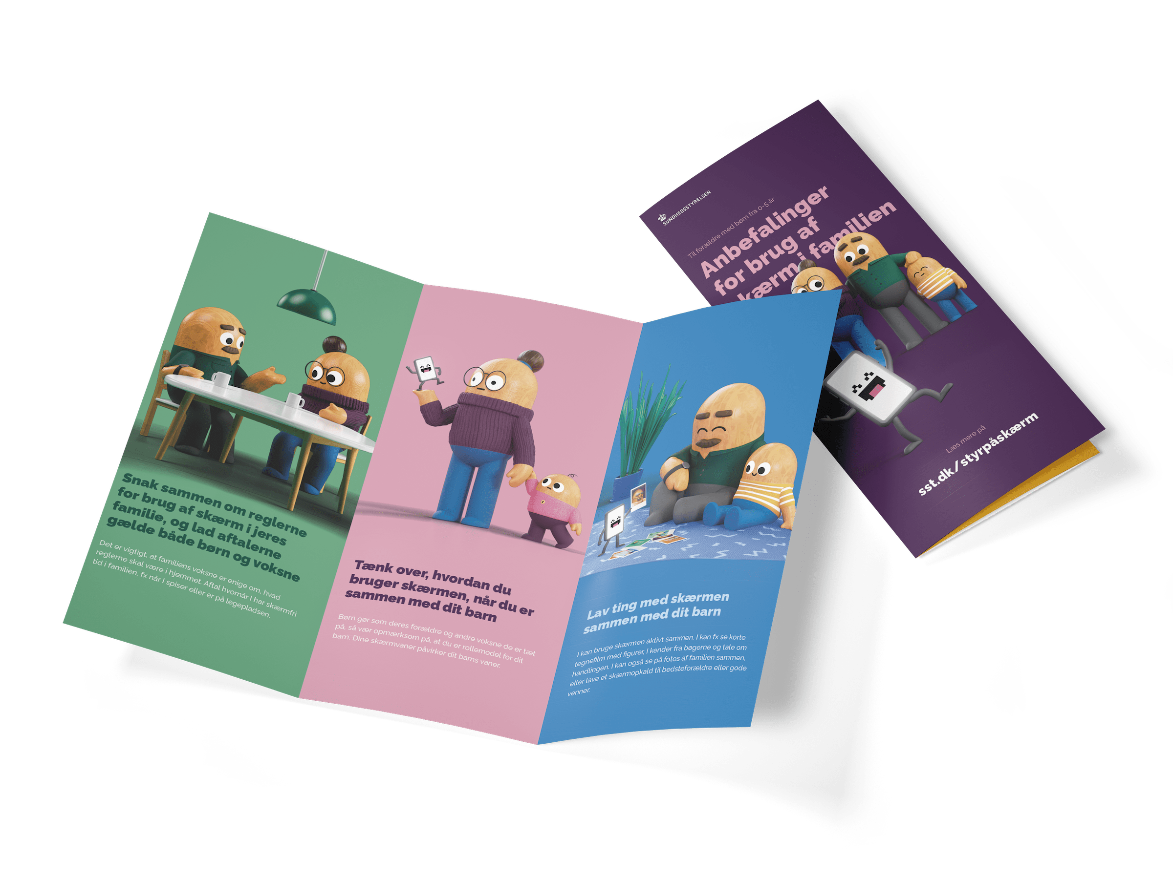
Additionally, our universe of wooden figures needed to be rolled out for printed material. These will be placed in schools, kindergartens, and other institutes where parents and kids go frequently.
Well, once you fall in love with a project, it is difficult to stop.
We created a Holiday Card using our new universe, to say thank you for the great cooperation, just for the fun of it.
What we did
-> Direction
-> Concept & Visual Development
-> Design
-> Illustration
-> Print
-> Animation
-> Original Music & Sound Design
Duration
4 months
Client
Sundhedsstyrelsen
The Danish Health Authority
Credits
Creative Director
Nicolaj Larsson
Production Manager
Martin Axelsson
Music & Sound Design
Natal Zaks
Art Direction
Nicolaj Larsson
Storyboard
Nicolaj Larsson
Design
Andreas Elleby Jørgensen
Modeling, Rigging, Texturing & Rendering
Andreas Elleby Jørgensen
Character Animation
Andreas Elleby Jørgensen
David Weidemann
Martin Kundby
Motion Design
Philip von Borries
Print material ideation & layout
Stine S. Larsen
Philip von Borries
Talk to us
Follow us
